Step Into My Shoes: Crackin’ Café
Xintong Liang (Sammy)
Context
Social interaction is playing a significant role in helping people on the autism spectrum to overcome socialization difficulties. It is recommended to be heavily integrated into their lives as early as possible. But in fact, the current social environment cannot meet this demand and the reality is not as ideal as people expect either.
/
Concept
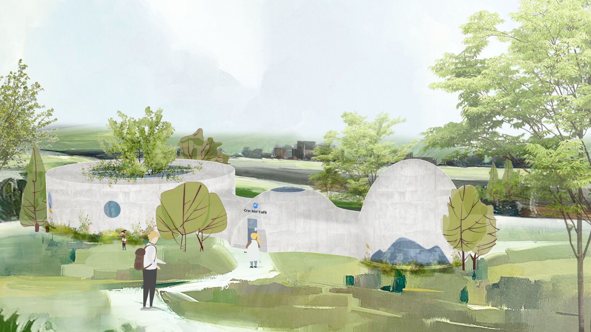
Crackin’ Cafe is an autism-friendly cafe that aims to create an open, safe, inclusive and comfortable environment for the autistic community to speak out and for the public to walk into their world.
Here, people on the autism spectrum could find a job, a connection to people and society. Parents whose children are on the spectrum could have a place to share experiences and information. Kids are on the spectrum could play around with friends. The general others could have a chance to know about autism in the real life. And the spirit the Crackin’ Cafe encourages is to break through limits and embrace a new life.
/
Architecture & Interior Design
Open, Safe, Inclusive, Comfortable.
The architecture design of the Crackin’ cafe is inspired by eggs to create a sense of protection. And the name of the cafe is originated from the word “cracking,” an onomatopoeia for cracked eggshells, suggesting “breaking limits.” It also has another meaning of “excellent” and “extremely.”
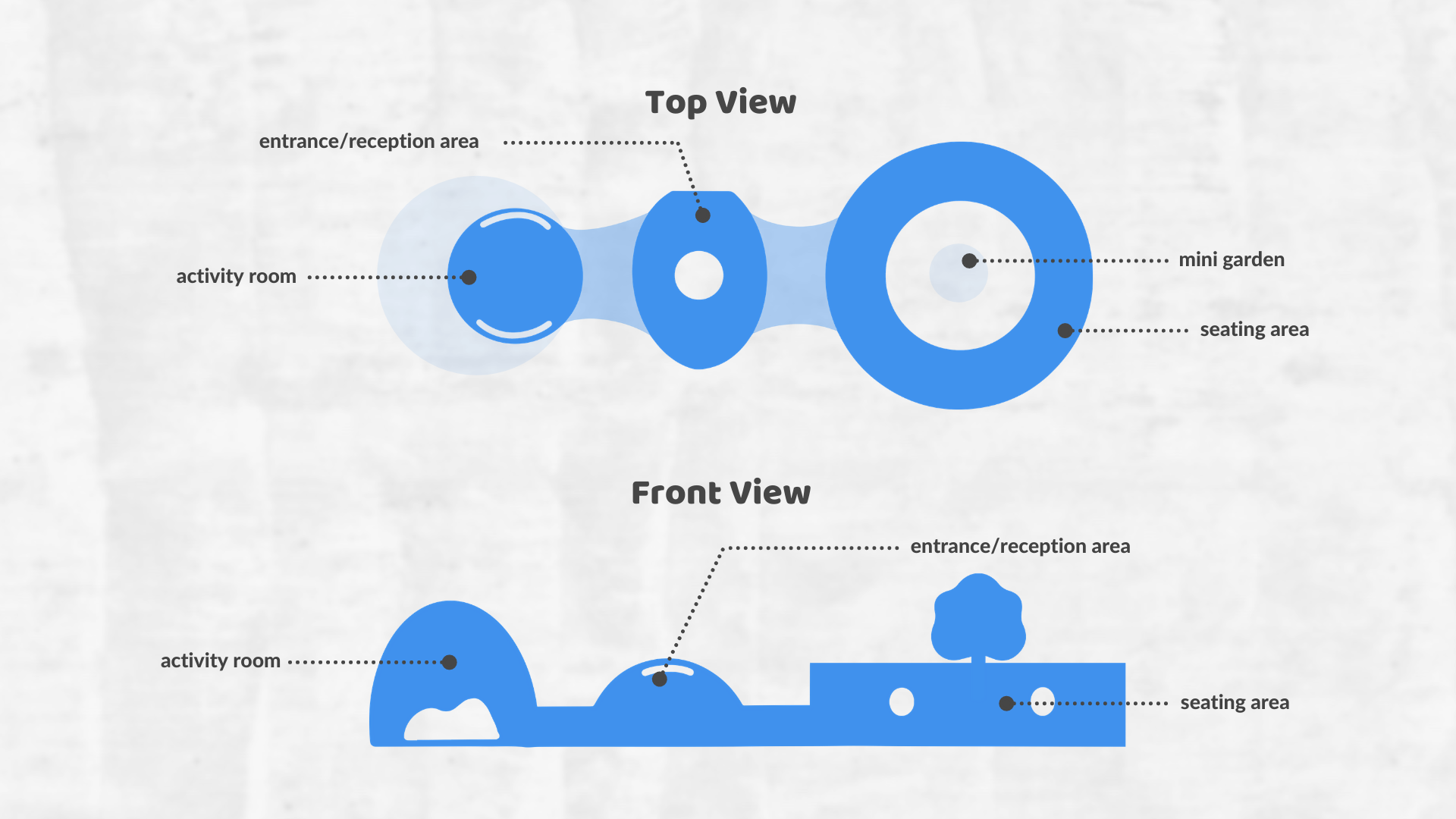
- Entrance & Reception Area
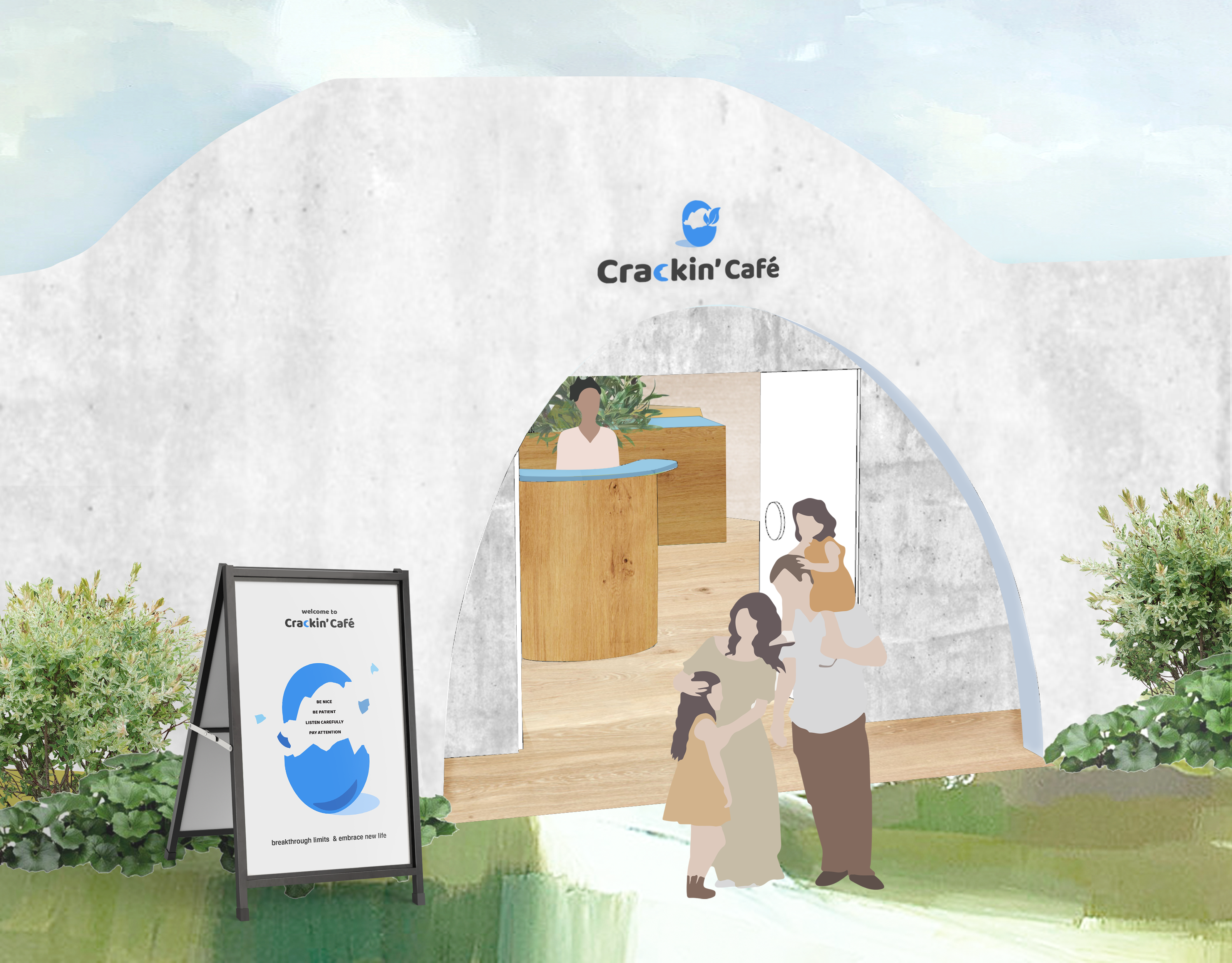
Features
Automatic door
People in wheelchairs could access the space without any blocks.
Reception Desk
It is where people can sign in for their reservation or wait to be seated or led to the activity room. They can get the communication kit here as well.
The Indoor Green Plants
Divide different functions in this area.
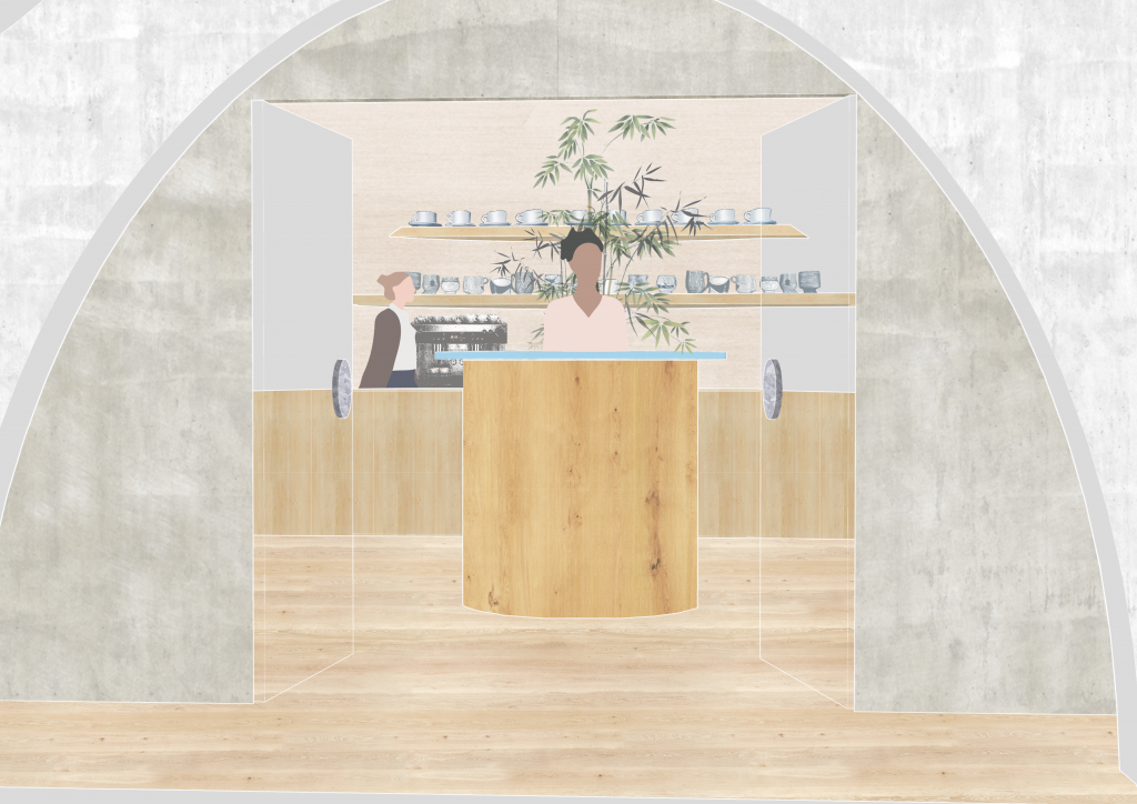
Coffee Bar
The coffee bar is located in the reception area to ensure the seating area and activity room are quiet enough for people on the spectrum to socialize.
- Seating Area
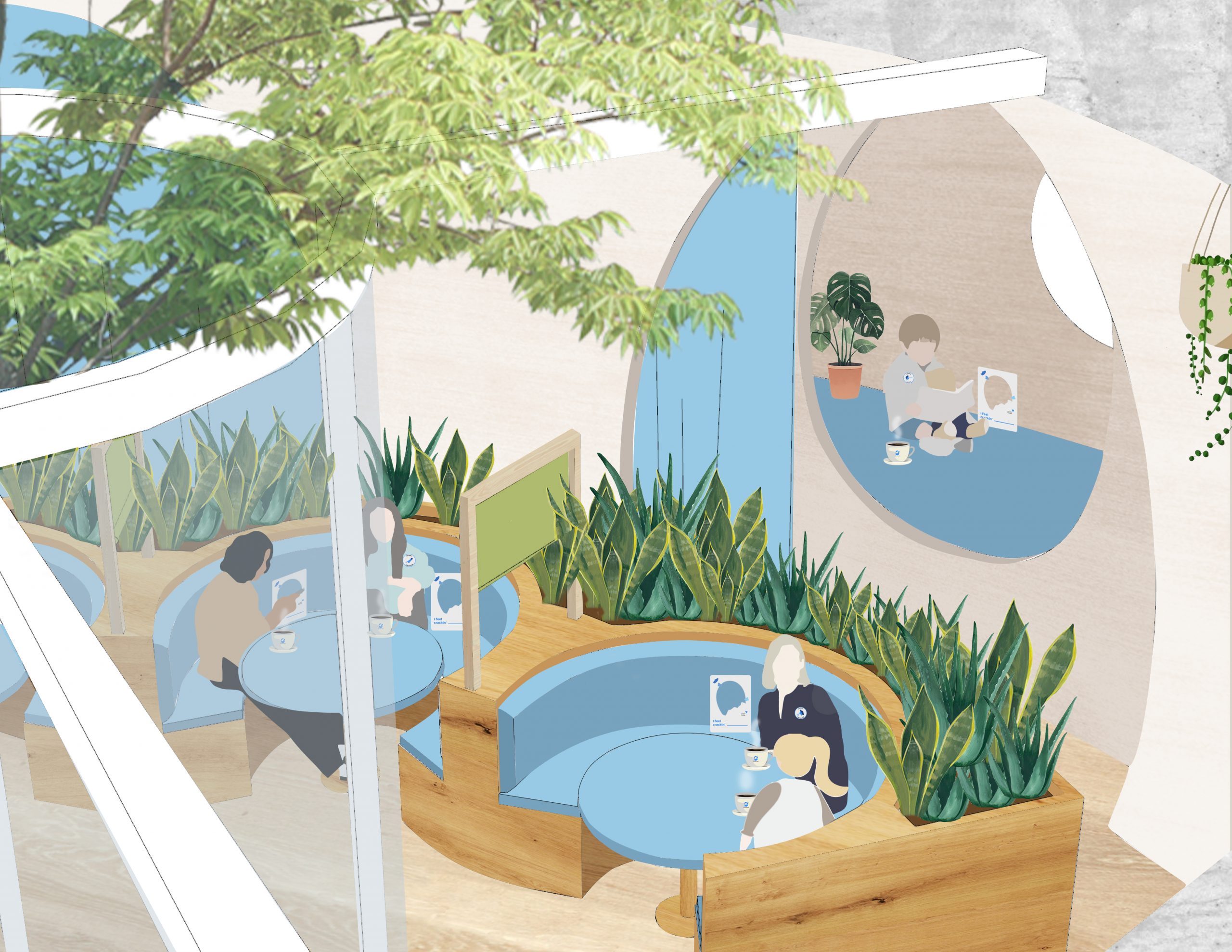
Features
Mini Open-air Garden
Natural elements could help people on the ASD spectrum with sensory integration and stress releasing. The garden is surrounded by glass, but people could get into the garden through a door and get some fresh air, interact with nature when staying in the cafe.
Features
Private room
These rooms are designed to comfort people’s overwhelmed emotions and to provide more possibilities and flexibilities for people to use the space.
There is a total of four private rooms in the seating area. They are behind the public seating, separated by curtains with sound absorption. A small closet is behind the curtain before entering the room. People could take off and hang their shoes and coat there as their need.
- Activity Room
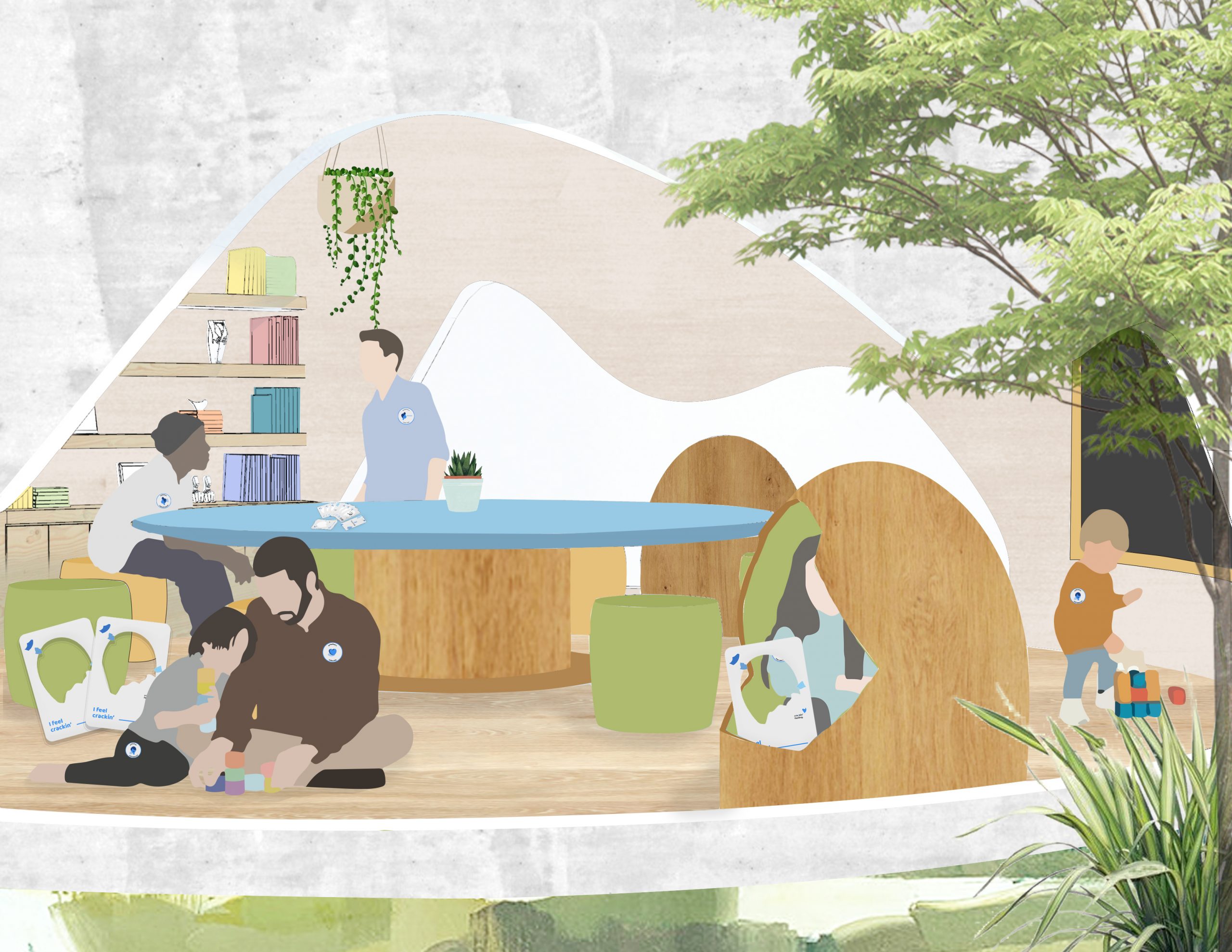
Features
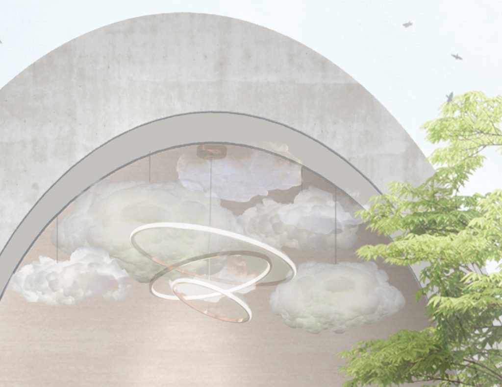
Cloud-like Ceiling Decoration
As the activity room area is 7m in height, the decoration is made of materials with sound absorption to reduce the echo in the space to ensure a quiet environment for people on the ASD spectrum. It is also used to visually adjust the height of the space.
Light
This is a light that can adjust brightness and colour according to the need of different people or events.
Features
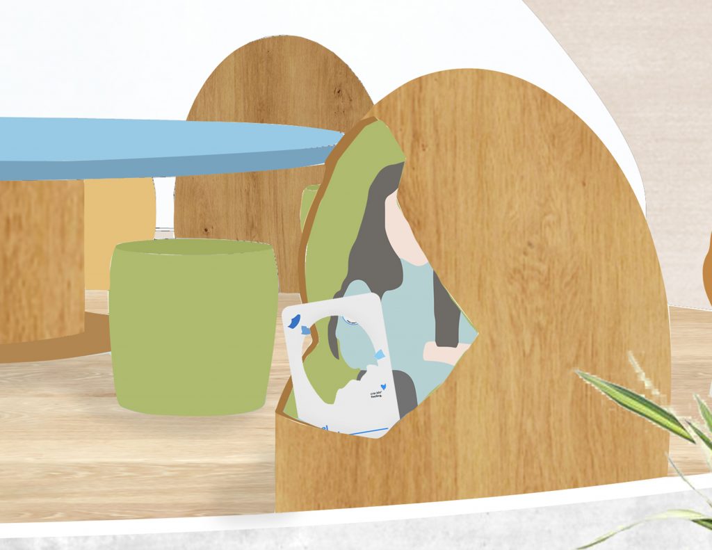
Eggshell sofa
Inspired by the eggshell, this is a one-person-use sofa designed for comforting people’s overwhelmed emotions during activities.
As people on the ASD spectrum feel pleasant when touching materials like cotton, the sofa will be very soft like embracing the person sitting inside. And it is face to the window so that people sitting in the “eggshell” could visually stay connected with nature.
/
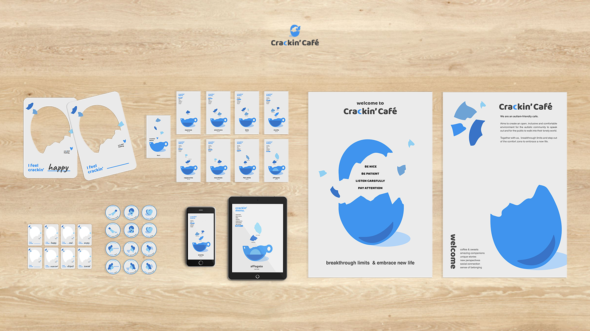
Visual Identity & Communication Kit Design
Friendly, Neat, Informative.
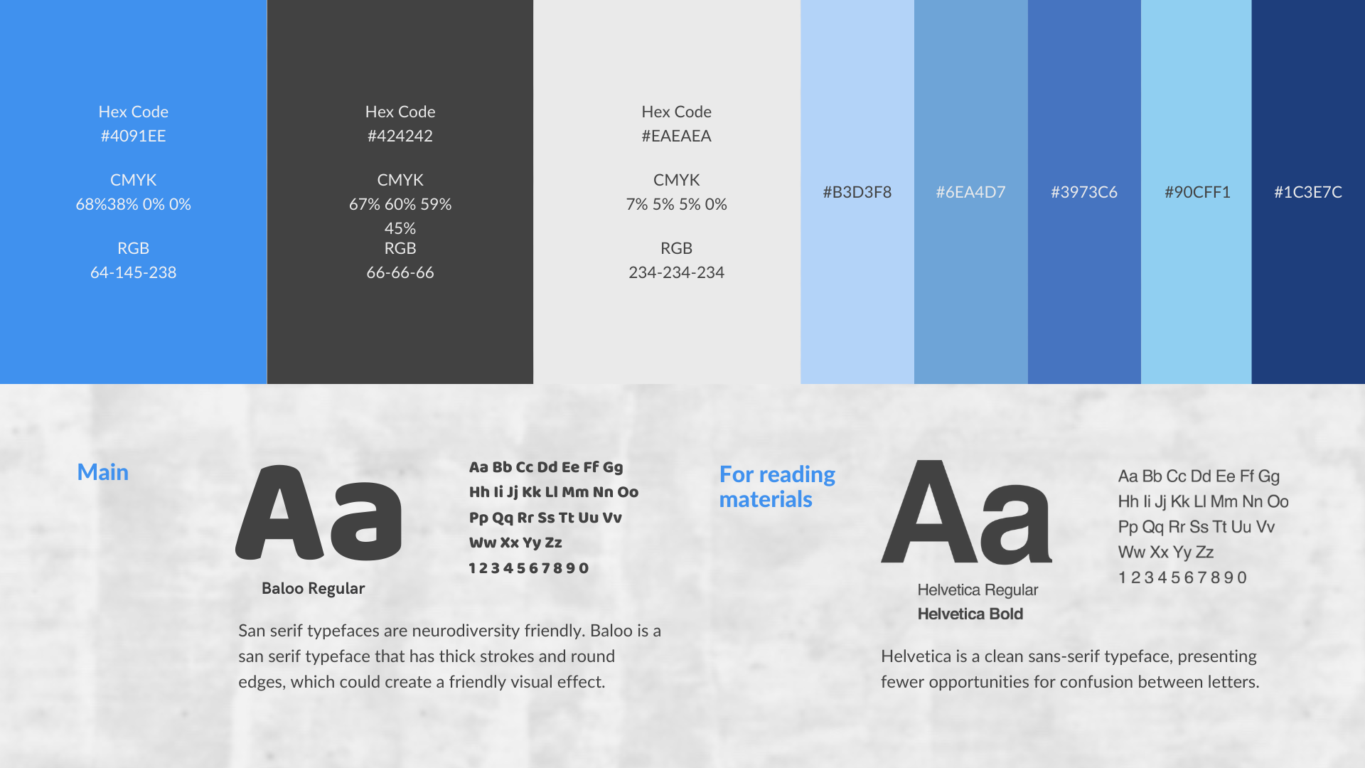
The visual system is related to the architecture, so “egg” is still the element that applies in the design. Blue, a colour aids concentrating and associates with calm feeling, is a representative colour of autism. Therefore blue is the main colour for this visual system. And considering people on the autism spectrum cannot process so much information one time, the design will remain neat and clean.
- Colour Palette & Typography
In addition to the blue, a dark grey is applied to text contents and a light grey is used as a background colour to reduce the contrast according to autistic populations’ reading preference. San serif typefaces are chosen as they are neurodiversity friendly.
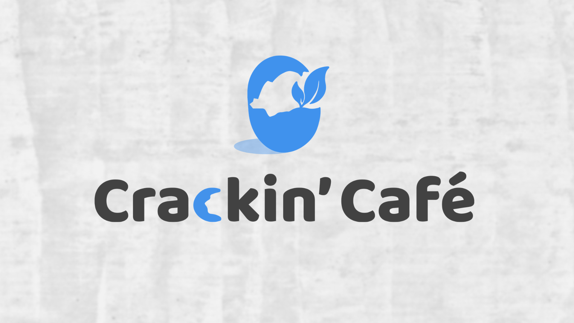
- The Crackin’ Cafe Logo
Inspired by the saying: “If an egg is broken by an outside force, life ends. If broken by an inside force, life begins,” this logo represents breaking through limits and stepping out of the comfort zone to embrace a new life, which responds to the concept of cafe.
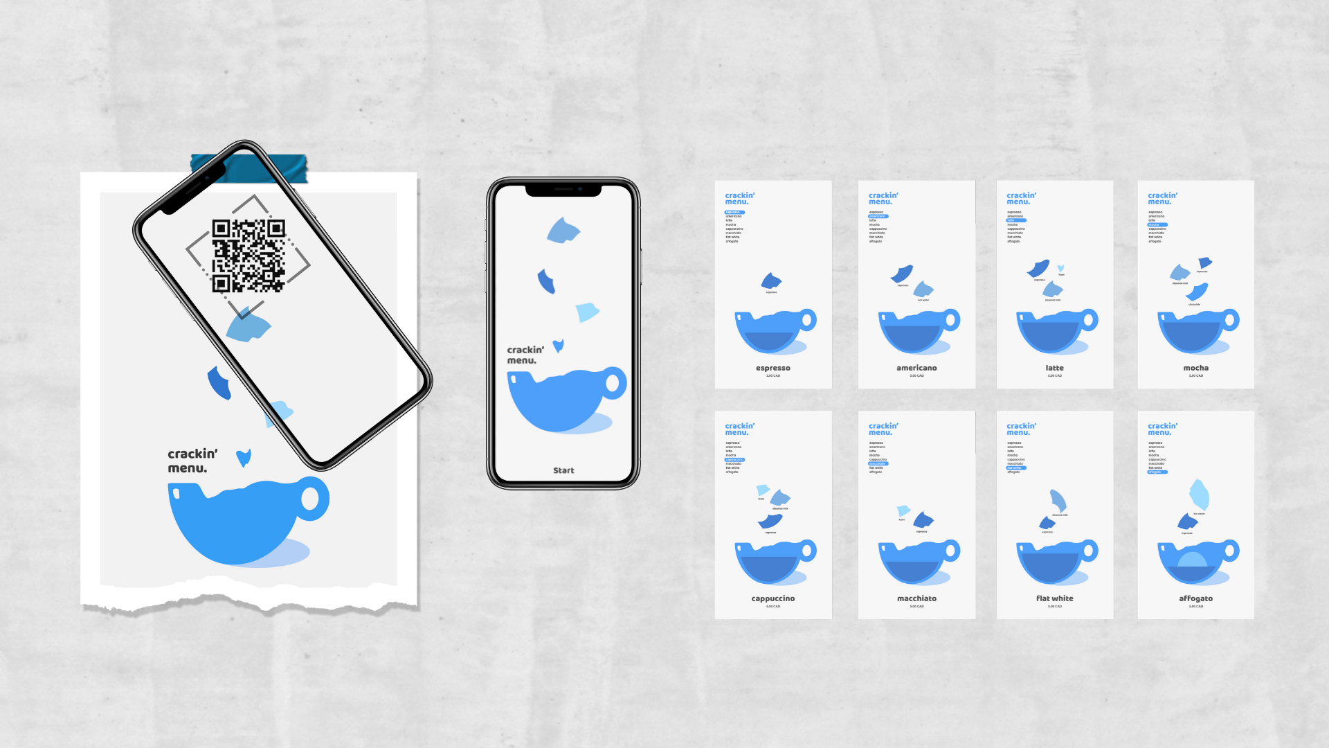
- The Crackin’ Cafe Menu Design
Considering some of the people on the autism spectrum may struggle with processing large amounts of information one time, in order to aid concentration and make the menu more inclusive, each page only contains one item. And all the ingredients are listed above the item as well to offer clear information for people to make a decision. The menu will be posted on the wall by the coffee bar. People could also access the digital version by scanning the QR code so that they can make their order wherever in the cafe without lining up at the entrance.
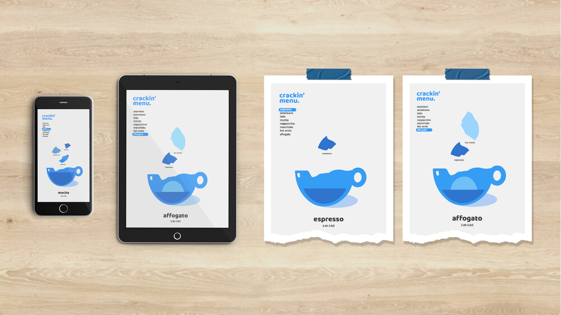
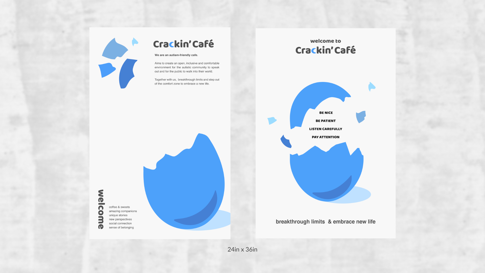
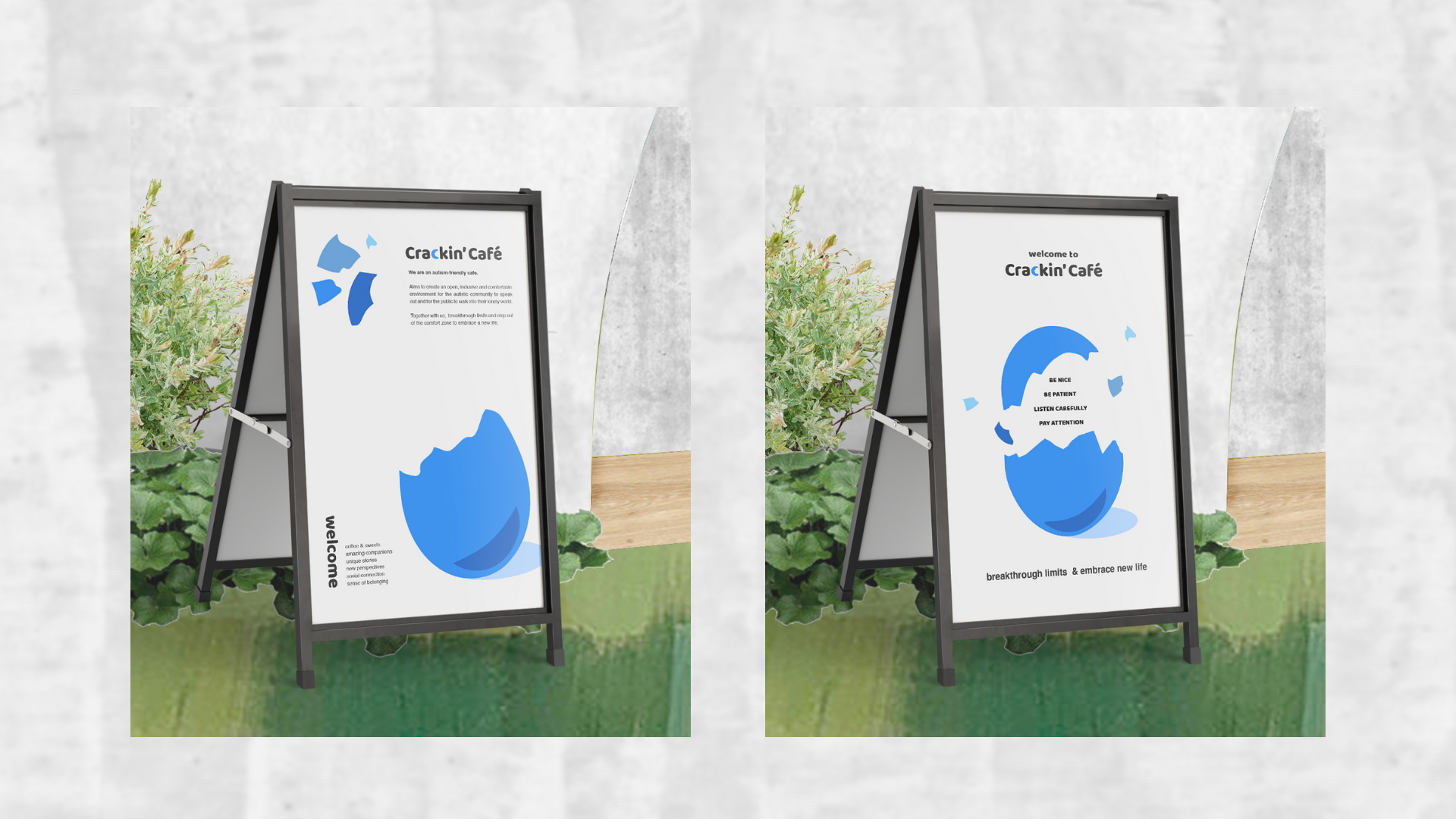
- The Crackin’ Cafe Poster Design
The poster will be placed in front of the entrance of the cafe, telling people about who we are and offering some tips on what needs to pay attention to in the cafe.
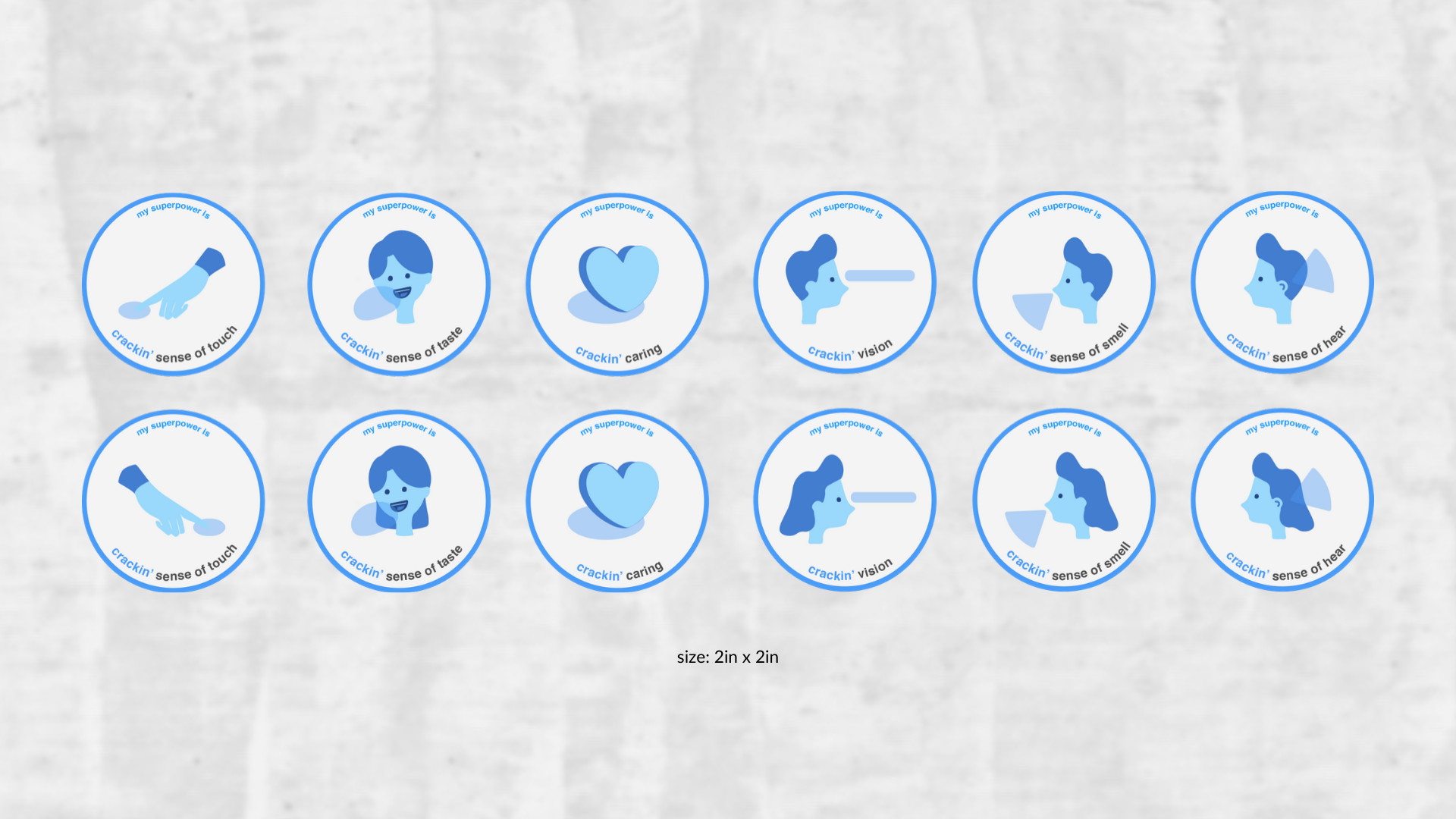
- Communication Kit I : “My Superpower” Sticker
These stickers are created to help with self-introduction. As people on the autism spectrum have different characteristics that others may need to notice during socializing, these stickers could help people notice others’ characteristics and what they need to pay attention to without asking awkward questions. In the sticker, each characteristic is said as a superpower so that people do not have to feel embarrassed or inferior because they are different from others.
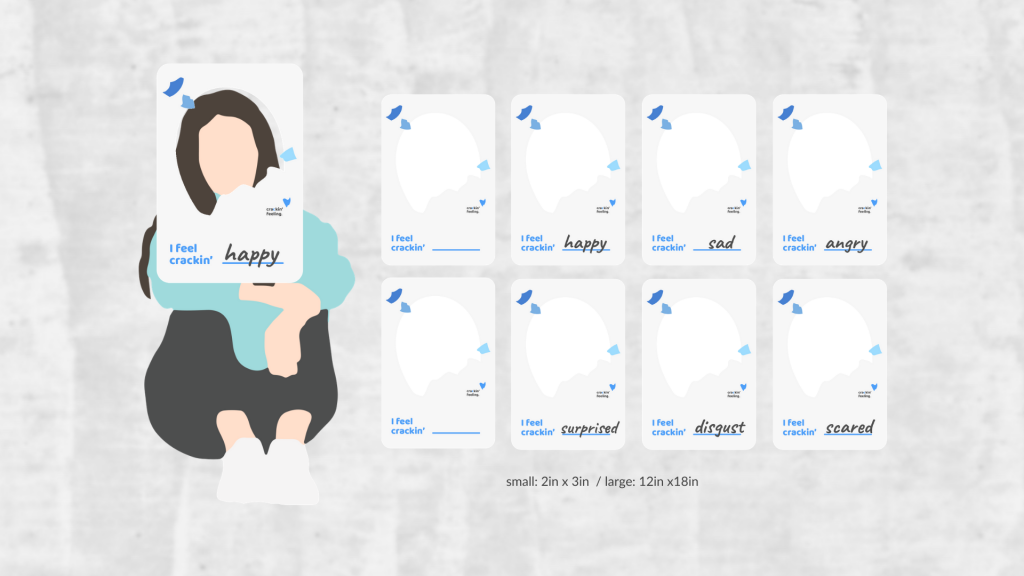
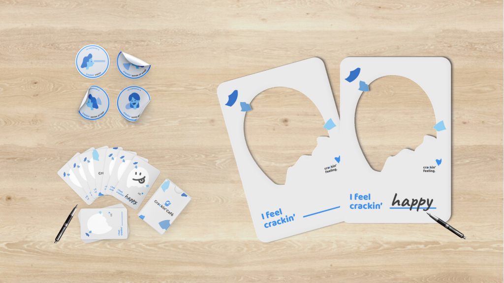
- Communication Kit II: Emotion Cards
As some of the people on the autism spectrum have difficulties in identifying emotions, emotion cards are designed to aid people in understanding emotions during conversations. People could choose the size according to their needs. They could use the large card as a photo frame, tell stories or take photos with it. They could also draw on the small card, use it as the emotion poker to spice up the conversation.
Instructor | Charlotte Falk